
How to choose the right images for your website
I’ve been creating websites for over ten years, and in that time the online world has become increasingly visual. We know it’s important to include images on your website, but how do we choose the right ones?
In this post, I cover a few of the things to look for when choosing photos for your website. I have focused on images for service providers as that’s my speciality. And I haven’t mentioned illustration as I wanted to keep it as short and easy to follow as possible.
If you haven’t got any photos yet, you could use these tips with my list of where to get photos for your website.
People like other people
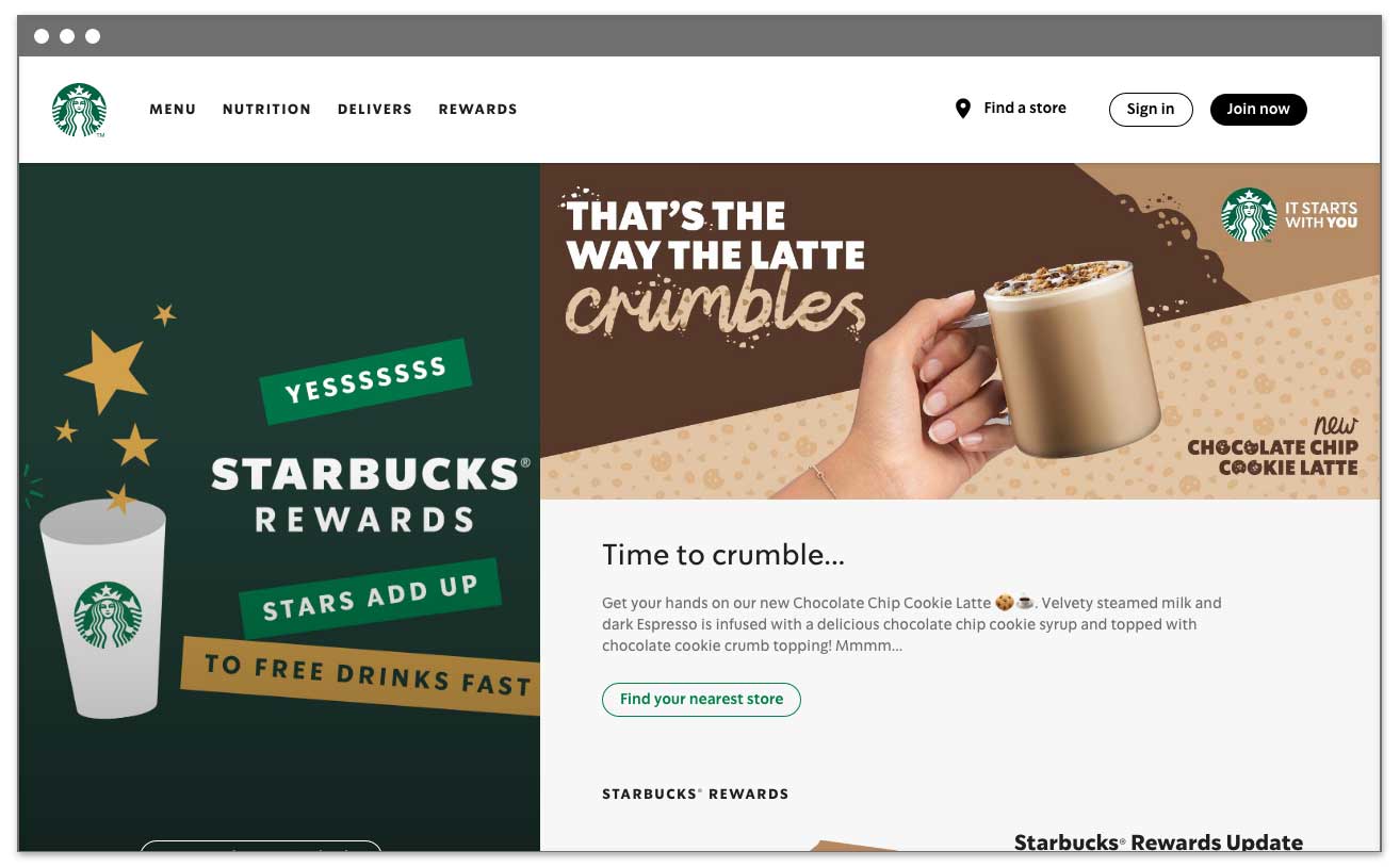
Add a human element to help you build a connection with your website visitors. In particular, people are drawn to human faces – especially smiling ones. But you don’t have to show faces – for example, you could use an image of hands on a keyboard.
Feature people who resemble your target audience. This might seem obvious, but plenty of big brands get it wrong. For example, retail experts have said that one reason why Marks & Spencer struggles is that they have a 25-year-old dressed in clothes targeted at a 65-year-old (article for reference). It’s OK to be aspirational, but don’t exclude your current customers.


Keep it real
Look for realism in your images. A typical cheesy stock image has a group of models in business suits jumping in the air and laughing. But when was the last time that happened in your office? See my tips for choosing stock images.


Keep it simple
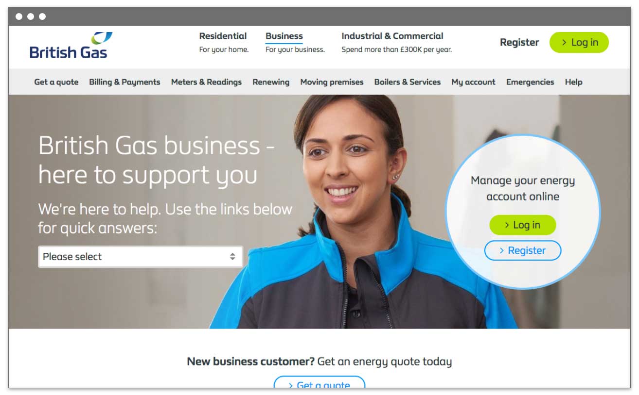
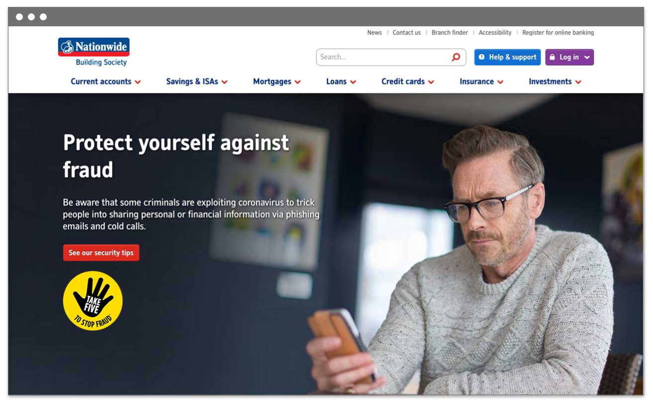
Don’t have too much going on in the image. Include empty space so you can add text over the top.
Think about different screen sizes
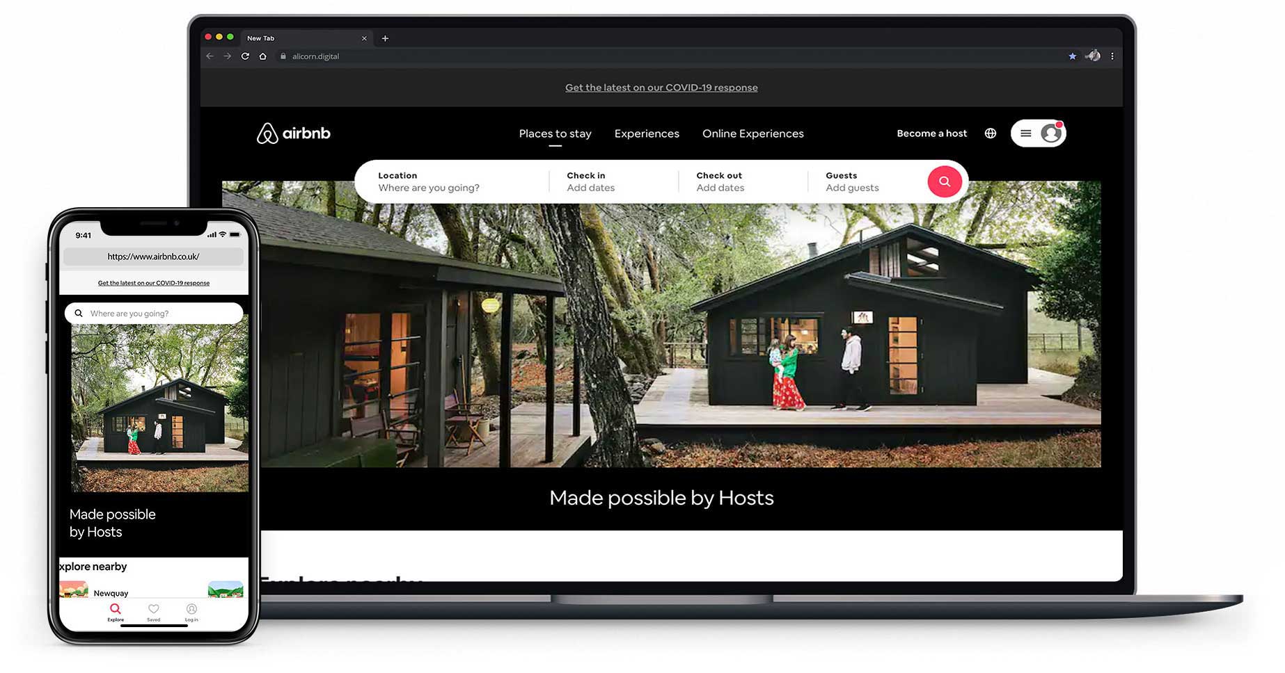
The image might be cropped differently on different devices, e.g. a laptop, tablet or mobile. These days, I start the design phase by thinking about how the website will look on a mobile first.
Keep it relevant
When someone lands on your website, they should know what you offer almost instantly.
Check that the images you use are relevant to the context. People have short attention spans, so you don’t want your audience to be confused – even for a second.
For example, unless you’re an animal shelter, don’t just use a photo of a cat. However, you could have a photo of your product with a cat sitting next to it. (I do, in fact, encourage the use of adorable animals in photos.)

I know it’s tempting to show multiple images in a slider or carousel. Collectively, a set of images in a carousel may give an accurate impression of what you do. But what happens when the image that the website visitor sees when they land on the website is the one that’s wrong for them? Will they sit and wait for the next slide? Hmmm... probably not. See what you can use instead of a slider.
Use them sparingly
We may love images, but stuffing a web page with them will mean it loads more slowly. You’ll also be more likely to have some images that aren’t actually enhancing your message (unless you’re writing about using images, of course 😉).
If you sell services, one or two photos per page should be enough. You can still break the text up using headings, bullet points, and background colours.
Check the quality
Use high-quality photos or videos as the image may take up the full width of the screen.
To do a quick check of the image quality:
- Double-click the image to open it with your default app.
- Expand the preview window to view the image at the size that you will be using it on the website.
- Make sure it doesn’t look blurry, grainy, or pixelated at that size.
You can usually enhance a low-quality image using a photo editor like Photoshop or Pixlr (or hire a designer to do it for you).
Stick to one style
When choosing images to use for your website or other marketing material, stick to one style of image. Some websites benefit from using bold, colourful images while others may use more subtle colours. It depends on your audience and the message you want to convey.
Image checklist
So to summarise, here are the tips for choosing the right image for your website:
- People like other people
- Keep it real
- Keep it simple
- Think about different screen sizes
- Keep it relevant
- Use them sparingly
- Check the quality
- Stick to one style
Further reading
Where to get images for your website ›